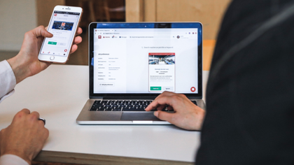
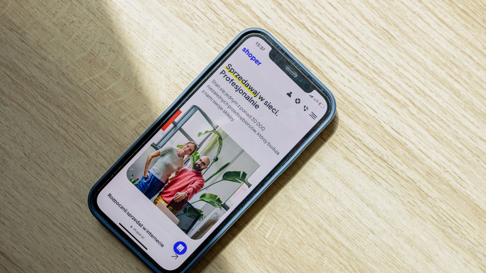
Your website may be the first place a potential customer meets your business. If that person opens it on a phone and finds tiny text, broken sections, awkward menus or buttons that are difficult to tap, the impression is already damaged. A professional website needs to work where your customers are actually using it, and for many businesses, that means mobile.
I have always considered mobile usability part of the website itself, not something to fix after launch. A visitor should be able to understand what the business does, find the information they need and take action without constantly zooming or struggling with the layout.
A mobile-friendly website also makes the business easier to access. Someone might discover a company through Google, Instagram, Facebook, an online advert or a link shared by a friend. If that person is already holding a phone, the website needs to respond properly to that situation. This is one reason building an online presence quickly should include mobile usability from the start.
The basic things matter more than many businesses realise. Contact details should be visible. Navigation should be simple. Text should remain readable. Buttons should have enough space around them. Forms should work without unnecessary difficulty. Images should display correctly without making the page awkward to scroll.
A business website also needs the right pages. A customer may want to check services, prices, company information, testimonials or contact details before making a decision. Planning what pages can be built in a 72-hour website helps prevent the mobile version from becoming an afterthought.
There is another point I think businesses sometimes overlook: mobile-friendly does not have to mean boring. A website can still carry strong branding, attractive visuals and a professional appearance while being easy to use on a small screen. Are 72-hour websites custom designed? is useful for understanding how speed and design can work together.
Performance matters as well. A visitor using mobile data may not have the same connection speed as someone sitting at a computer with a fast broadband connection. Heavy images, unnecessary scripts and poorly handled media can make a website feel slow. Keeping the page efficient makes the experience more practical.
The same attention should go into testing. A website that looks fine on one phone may have spacing or layout problems on another screen size. Before calling a project finished, I would check the important pages, menus, forms, buttons and content on mobile devices.
This does not mean mobile testing has to delay a fast website project. When the requirements are clear and the work is properly organised, a business website can still be completed and ready within 72 hours. What makes a 72-hour website project successful explains why preparation and clear requirements matter so much to the timeline.
For a business owner working with a tight budget, the goal should also be to understand what is actually included rather than paying for features that are not needed. Looking at what a 72-hour website package includes can help clarify the scope before development begins.
The price will naturally depend on the number of pages, design requirements and functionality involved. How much a website built in 72 hours costs gives more context for businesses comparing development options.
Ultimately, mobile compatibility is about removing unnecessary barriers between your business and the people trying to reach it. A website does not need to be complicated to be useful. It needs to load properly, present information clearly and make the next step obvious.
That is why I see mobile-friendly development as a basic requirement for any modern business website. With the right preparation and a defined scope, the site can be professionally built, tested and ready within 72 hours rather than leaving the business waiting weeks for a usable online presence.