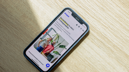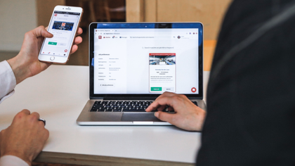
For many businesses, the first time a customer sees their website is on a phone. If the pages are difficult to read, the menu is confusing, or buttons are hard to tap, that visitor can leave before learning what the business offers. That is why I believe mobile-first design should be considered from the beginning, not added after the website is finished.
Mobile-first design means creating the website around the smaller screen first, then adapting it for tablets and desktops. It is more than simply shrinking a desktop layout. Navigation, text, buttons, images, forms, and spacing all need to work comfortably on a touchscreen.
A good mobile website makes important information easy to find. Menus should be simple, buttons should be easy to tap, and visitors should not have to zoom in or scroll sideways. For businesses building their online presence quickly, how to build an online presence for your business quickly shows why getting the fundamentals right matters.
Content also needs to be considered carefully. Long paragraphs and oversized images can make mobile pages frustrating to use. I prefer clear headings, short sections, readable text, properly sized images, and enough space between elements.
The number of pages should serve a purpose too. A business might need Home, About, Services, Contact, FAQ, Portfolio, Booking, or other relevant pages, but there is little value in adding pages simply to make the website look bigger. What pages can be built in a 72-hour website gives useful context when planning a focused site.
Mobile-first does not mean the website has to look plain. Strong branding, professional images, custom sections, and attractive typography can still be used. Are 72-hour websites custom designed? explains how speed and personalised design can work together.
Performance matters as well. Heavy images, unnecessary animations, and excessive features can make a mobile website slow. A professional site should look good while remaining practical to use.
Testing before launch is just as important. A menu that works on a computer may behave differently on a phone. Forms, buttons, images, and page layouts should all be checked on smaller screens. That attention to detail is part of what makes a 72-hour website project successful.
The good news is that mobile-first design does not prevent a website from being completed quickly. With the necessary content, images, branding, and requirements prepared in advance, development can stay focused. What you need to provide to get your website in 72 hours explains how preparation helps keep the process moving.
A fast website should still feel like a proper business website. The goal is to have the agreed website completed and ready within 72 hours while making sure it works properly across devices. Can you really build a professional website in 72 hours? explores that balance between speed and quality.
For businesses that need to move quickly, a website built in 72 hours can include mobile-first thinking from the start rather than treating it as an afterthought.
A website should work wherever customers are looking for you—and increasingly, that means a phone.
Email: admin@auxisherpa.com