
Think about the businesses you recognise immediately when you see their logos. You may not have bought anything from some of them, yet their designs are familiar to you. That is the power of a memorable logo. It creates a visual connection between a business and the people who see it, sometimes long before they become customers.
The first quality of a memorable logo is simplicity. When a design contains too many symbols, colours, words and decorative details, people may struggle to understand it at a glance. A simpler design gives the brain fewer things to process and makes the main idea easier to remember. This does not mean every logo must look plain or use only one colour. It means each design element should have a clear reason for being there.
The second quality is distinctiveness. Your logo should help people identify your business without confusing it with another brand. If you use a common symbol, ordinary lettering and colours that several competitors already use, customers may find it difficult to tell your business apart. Studying competitors can help you understand the market, but the aim should be to find a visual direction that feels appropriate for your own brand.
The third quality is relevance. A memorable logo should suit the business it represents. A brand serving young children may choose a friendly and colourful design, while a law firm may prefer a more restrained and professional appearance. Neither approach is automatically better than the other. The important thing is that the design matches the audience, the service and the kind of experience customers should expect.
Colour also plays an important role in recognition. Businesses often choose colours based on the feelings and associations they want to communicate. Blue may be used to suggest trust, while green is often associated with nature or growth. However, colour meanings are not universal, and customers do not all respond in the same way. The best choice is a combination that fits your brand and remains clear and consistent across your marketing materials.
Another important quality is readability and versatility. Customers may encounter your logo on a website, a social media profile, a product label, a uniform or a small advertisement. The design needs to work in all these places. A logo that looks good only when it is large is not enough. Test it at different sizes, check that the business name remains readable and make sure the design still works when displayed in a single colour.
Consistency helps turn a good logo into a familiar brand symbol. When a business uses different versions of its logo, changes its colours frequently or redesigns its identity without a clear reason, customers may find it harder to recognise. Once you have chosen a suitable design, use it consistently across your website, social media pages, advertisements and business documents. A logo becomes more familiar through repeated exposure, especially when customers have positive experiences with the business behind it.
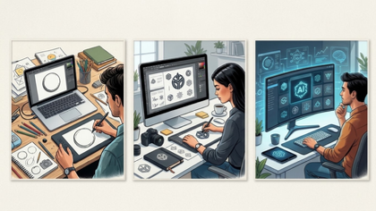
A memorable logo is therefore not necessarily the most expensive, complicated or fashionable design. It is a design that people can recognise, understand and associate with your business. AI logo generators can help entrepreneurs explore possible concepts, but the results should be reviewed carefully for originality, readability and suitability. Businesses that need a more distinctive identity may benefit from professional design assistance to refine their ideas and create a consistent visual system.
Auxi Sherpa helps businesses explore practical solutions for building a stronger brand and improving their online presence. Whether you are launching a new company or reviewing an existing identity, begin by understanding your customers and what makes your business different. Then choose a logo that communicates that difference clearly. The ultimate goal is not simply to make people admire your design. It is to help them remember your business when they need what you offer.
See you at the top
Auxi Sherpa