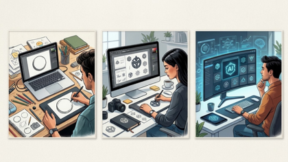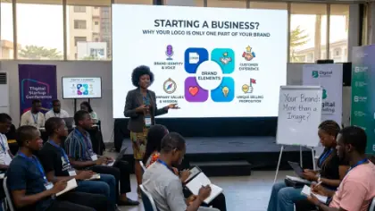
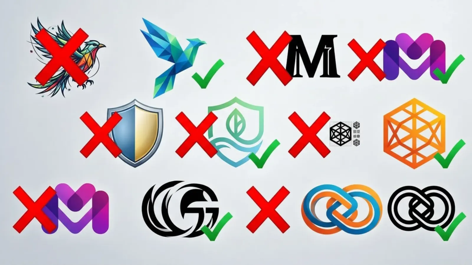
A logo may look like a small part of a business, but it can influence what people think about your brand. Before customers buy your products, book your services or contact your team, they may see your logo on social media, a website, a business card or an advertisement. If the design looks confusing or poorly made, some people may question the quality of the business behind it.
The first mistake is using too many colours and fonts. A logo does not need every colour that looks attractive or several different lettering styles. Too many design elements can make it difficult to understand and remember. A strong logo usually uses a simple colour combination and lettering that suits the business. The goal is not to make the design look empty, but to make every element serve a clear purpose.
The second mistake is choosing a design that is difficult to read. Some businesses use decorative fonts that look beautiful when enlarged but become almost impossible to understand on a small phone screen. Others place the business name inside complicated shapes or combine letters in ways that confuse customers. If people have to struggle to read your business name, your logo may not be doing its job.
The third mistake is copying another brand. It is reasonable to study successful businesses for inspiration, but copying their logos can make your business appear unoriginal. Customers may confuse your brand with another company, and you could face legal problems if your design is too similar to a protected trademark. Your logo should communicate your own identity, not make your business look like a cheaper version of someone else’s.
The fourth mistake is using the wrong image or symbol. A design might look attractive without telling customers anything useful about the business. For example, a company that sells professional financial services needs a visual identity that inspires confidence. A children’s clothing brand may benefit from a more playful approach. The right design depends on your audience, your industry and the impression you want people to remember.
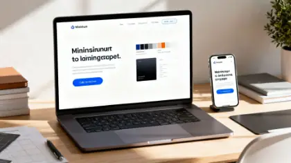
The fifth mistake is failing to check how the logo looks in different places. A design that looks impressive on a large computer screen may become blurry on a phone, difficult to print on packaging or almost invisible against certain backgrounds. Before approving a logo, test it in small and large sizes, on light and dark backgrounds, and across the platforms where your business will appear. Make sure you can access suitable file formats for both digital use and printing.
The good news is that a professional-looking logo does not always require an enormous budget. What matters is having a clear idea of your audience, choosing a suitable design direction and checking that the final result works in real situations. AI logo tools can help businesses explore ideas quickly, while professional design support can help refine the result when originality, technical quality or a more distinctive brand identity is important.
At Auxi Sherpa, businesses can explore practical ways to develop their visual identity and create a stronger online presence. Your logo should not simply decorate your business. It should help people recognise your brand and feel confident enough to learn more about what you offer. Before spending money on another design, take a fresh look at your current logo and ask whether it is helping customers understand and remember your business.
See you at the top
Auxi Sherpa